


The Role of Data Visualization in Communicating Insights
Turn numbers into narratives! Discover how powerful data visualization transforms complex data into clear, compelling stories that drive understanding and informed decision-making. 📊 storytelling ✨

The Role of Data Visualization in Communicating Insights
Imagine staring at a massive spreadsheet filled with thousands of rows and columns of numbers. Can you quickly spot trends? Understand relationships? Probably not! That's the challenge data scientists and businesses face daily. Raw data, no matter how valuable, is often indecipherable to the human eye in its raw form. This is where the magic of Data Visualization comes in.
At Functioning Media, we understand that extracting insights is only half the battle; effectively communicatingthem is the other. Data Visualization is the art and science of presenting data in a graphical format, making complex information accessible, understandable, and actionable. This guide will explore its crucial role in the data science workflow and why it's a skill every data professional should master.
What is Data Visualization? 🤔
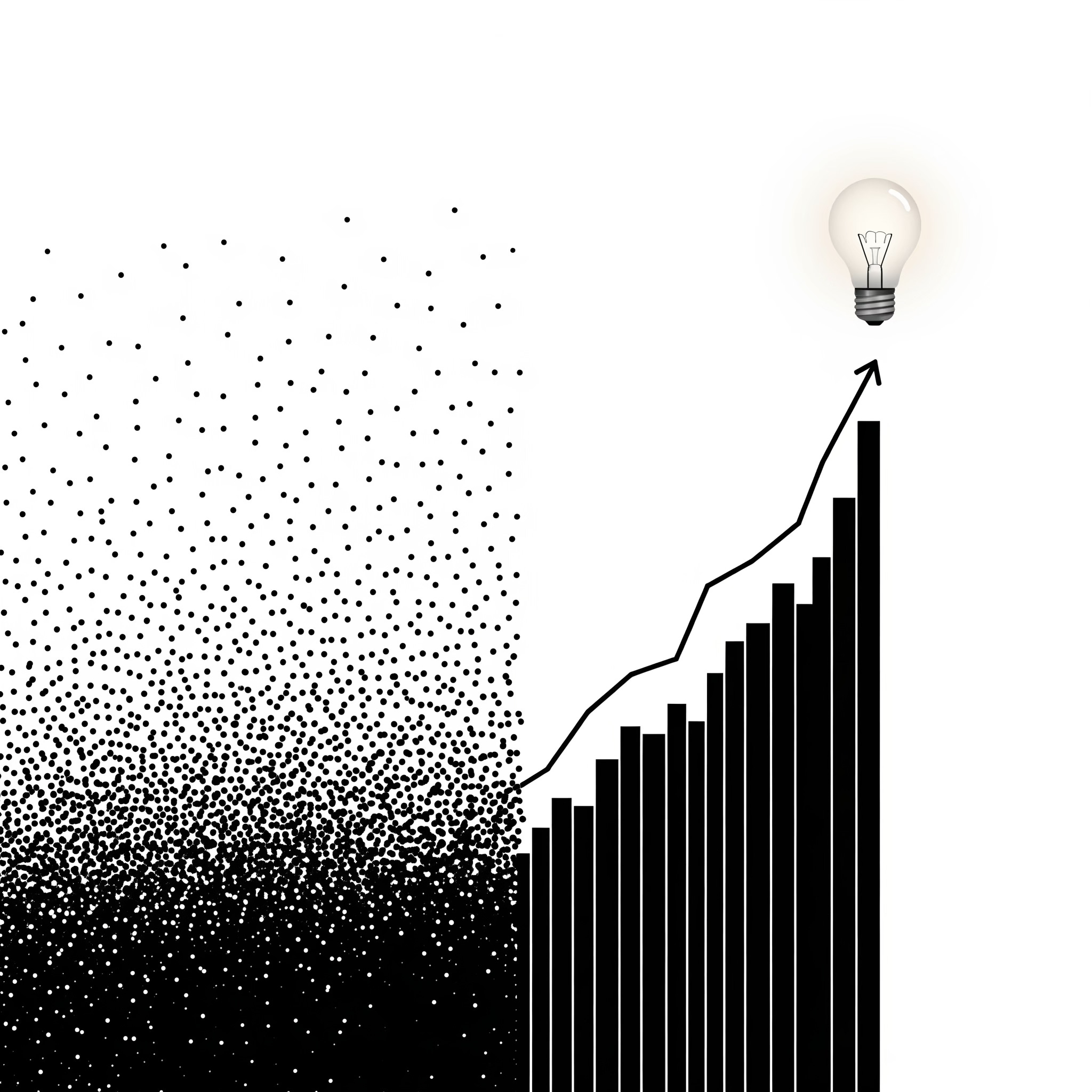
Data visualization is the graphical representation of information and data. By using visual elements like charts, graphs, and maps, data visualization tools provide an accessible way to see and understand trends, outliers, and patterns in data. It transforms abstract numbers into tangible, visual stories.
Why is Data Visualization So Important in Data Science?
Data visualization is crucial because it does so much more than just present numbers; it turns data into a powerful communication tool.
First, it simplifies complexity. Large, intricate datasets become immediately comprehensible when you see them laid out visually. This allows anyone to quickly grasp insights that would otherwise be hidden within raw numbers, making overwhelming data feel much more accessible.
Secondly, visualizations are excellent at revealing hidden patterns and trends. Our brains are naturally wired to recognize visual patterns, and charts can expose correlations, outliers, and trends that are nearly impossible to spot in a spreadsheet alone. It's like having a superpower that lets you see the unseen in your data.
This clarity then facilitates faster decision-making. When insights are clear, compelling, and easy to understand, decision-makers can react more quickly and confidently to new opportunities or challenges. There's less time spent trying to decipher data and more time acting on it.
Moreover, data visualization enhances communication. It effectively bridges the gap between technical data scientists and non-technical stakeholders. You can tell a persuasive story with data, making your findings not just accurate but also memorable and impactful for your audience.
Visualizing data early in the process can also identify data quality issues. Sometimes, errors, inconsistencies, or missing values that might go unnoticed during initial data cleaning will pop out clearly when you see the data visually. It acts as an extra layer of quality control.
Finally, effective data visualization promotes exploration and interaction. Many modern visualization tools allow users to interact with the data, filtering, drilling down into details, or hovering for more information. This empowers users to explore data at their own pace and derive their own specific insights.
Best Practices for Effective Data Visualization
Creating truly impactful visualizations is definitely an art form. Here are some of our best practices at Functioning Media:
1. Know Your Audience and Purpose: Before you even think about creating a chart, ask yourself: Who is this for? What specific message do I want to convey? And what action do I want them to take after seeing this visualization? A chart for a CEO will look very different from one designed for a fellow data scientist. Tailoring your visualization ensures it resonates and effectively communicates the intended insight.
2. Choose the Right Chart Type: This is critical! Different types of data and different purposes require specific chart types. For instance, bar charts are great for comparing discrete categories, while line charts excel at showing trends over time. If you're showing parts of a whole, pie charts can work, but use them sparingly, especially for many categories. To show relationships between two numerical variables, scatter plots are ideal, and heatmaps are excellent for showing patterns in large datasets. Using the wrong chart type can easily confuse your audience or even misrepresent your data.
3. Keep it Simple and Clutter-Free: Effective visualizations are clear and concise. Avoid unnecessary elements, often called "chart junk." Focus on clarity by removing excessive gridlines, redundant labels, or overly complex backgrounds. Simplicity always allows the key message to stand out immediately.
4. Use Colors Strategically: Color is a powerful tool to guide the eye and add meaning. Use it to highlight important data points, differentiate categories, or indicate magnitude (like warmer colors for higher values). However, be mindful of accessibility, including colorblindness. Overuse of color can be distracting and diminish clarity.
5. Provide Clear Labels and Titles: Every chart needs a clear, concise title that explains its main message. Axis labels, legends, and data labels should always be easy to read and understand. Providing good context is absolutely key for accurate interpretation of your visuals.
6. Tell a Story with Data: Your visualization shouldn't just be a standalone image; it should be part of a larger narrative. Guide your audience through the insights you've uncovered, highlighting what's most important and explaining why it matters. Using annotations to point out key takeaways within the chart can greatly enhance the storytelling. Stories are far more memorable and persuasive than just raw data.
7. Consider Interactivity: For online dashboards or reports, consider making your visualizations interactive. Allowing users to filter, drill down, or hover for more details empowers them to explore the data at their own pace and derive their own specific insights.
Popular Tools for Data Visualization
There are many excellent tools available for data visualization, catering to different needs and skill levels:
Python Libraries: If you're coding, Matplotlib, Seaborn, Plotly, and Bokeh are incredibly powerful and versatile.
R Packages: For R users, ggplot2 is a gold standard for creating elegant and informative plots.
Business Intelligence Tools: User-friendly drag-and-drop tools like Tableau, Power BI, and Qlik Sense are popular in business settings for creating interactive dashboards.
Spreadsheet Software: For basic charts and quick visualizations, programs like Excel and Google Sheets can also be very effective.
How Functioning Media Leverages Data Visualization for You:
At Functioning Media, our data scientists are not just experts in analysis; they are masters of visual storytelling. We transform your complex data into compelling, easy-to-understand charts, dashboards, and reports that empower you to grasp key insights at a glance and make truly data-driven decisions that propel your business forward.
Visit functioningmedia.com and subscribe to the newsletter.
#DataVisualization #DataScience #DataInsights #DataAnalytics #ChartsAndGraphs #BusinessIntelligence #DataStorytelling #VisualData #BItools #FunctioningMedia